


A strong versatile logo that embodies your service, along with a simple colour palette, gives a fruitful kick start for your marketing when starting your business.
This approach works well when the business owners are equipped and have the time to produce their own marketing materials.
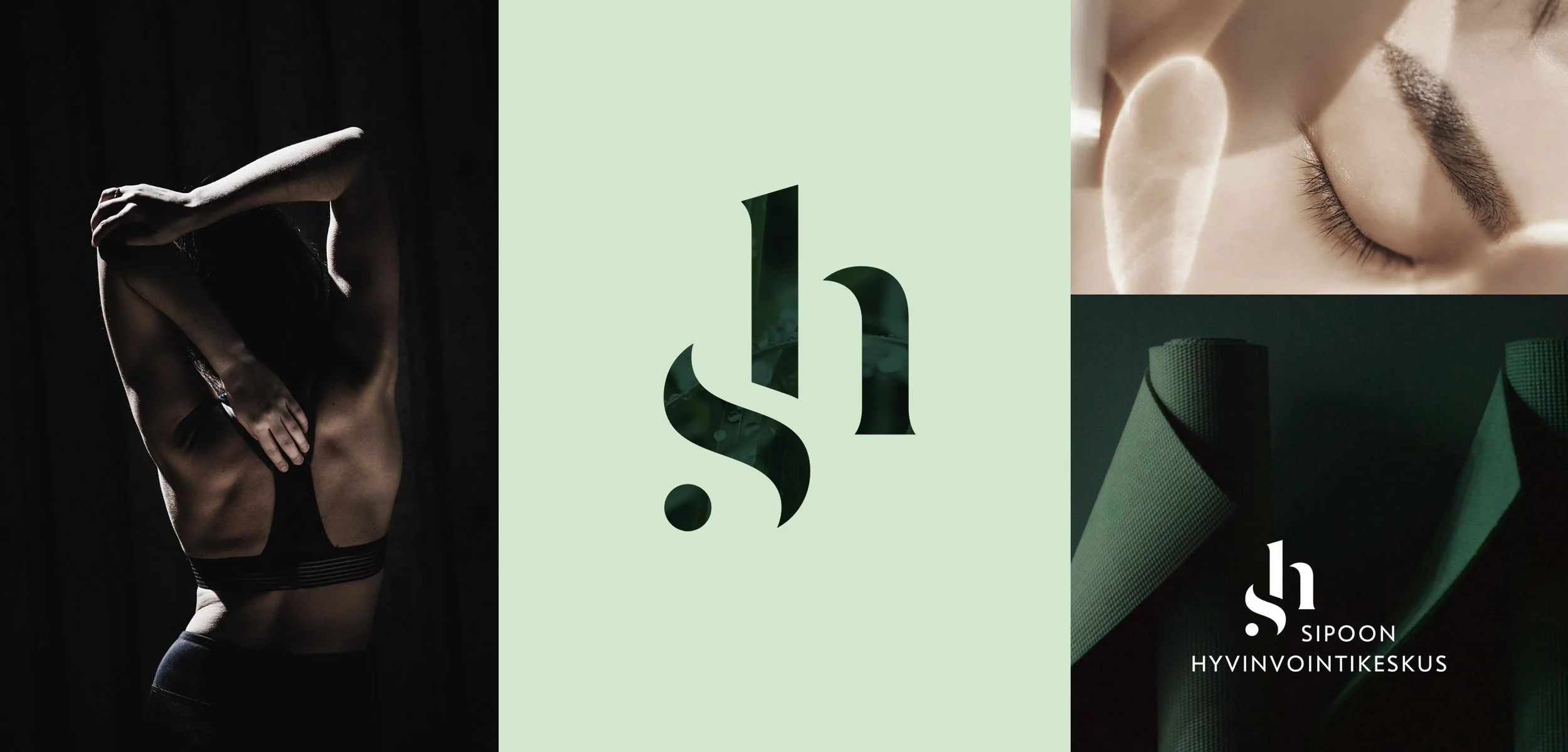
For Sipoon Hyvinvointikeskus (Sipoo Wellness Center) two complementing shades of green – light and dark – combined with black and natural whites produce multiple combination options. A compact colour palette helps to maintain a cohesive brand look when visualising the logo versions for different applications.
The initial letters of the company name S and H form a contrasting combination, where the strong body in the styled letter h is cocooned in a gentle touch of flow and care of the letter s. The combination of these two letters create a simple sense appeal – a calming sound of relaxation when pronouncing the two letters sh.
Using the logo monogram as branded illustration in different applications.