


Meira Baking range consists of high quality rising agents, thickeners and vanilla flavoured sugars. All that helps in achieving a successful end result when baking or making desserts and all things sweet.
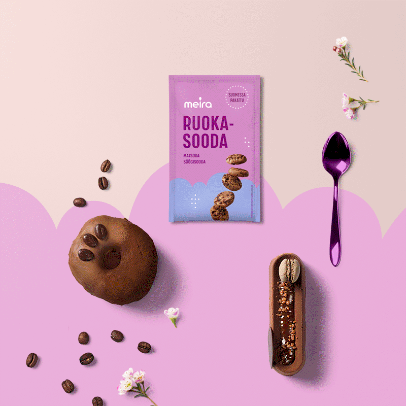
A happy baking experience is emphasised in the packaging design with delightful colour combinations, delicious images and the fluffy soft cloud shape.
Meira’s Vanilla Sugar is flavoured with genuine aromatic Bourbon Vanilla from Madagaskar. This competitive edge is communicated with separate bold marking on the front.
Each variant is illustrated with lively images of cakes, desserts and pastries that best represent a typical usage of the product. The images are informatively realistic and detailed, popping out nicely in contrast to the more minimalistic calm background.
The balance between these opposite illustrative styles – graphic minimalism and realistic photography – as well as harmonious colour combinations results in design that is clear in its communication, distinctive from competition and has a rich and vibrantly sweet sense of taste.
Meira Baking products are easily spotted from the busy store shelves due to their cohesive and distinctively recognisable purple-pink color identity, subtly separated from each other with sweet variant colors.
THE TECHNICAL SIDE OF COLOUR DESIGN
Each of the variant colours is designed so that the colour contrast to the pink background would be optimal to make the cloud shaped edge clearly visible.
Since the purple-pink background colour and variant shades are all middle range tones in both lightness and vividness, even a small contrast deviation of the tone in variant colour results in the cloud element’s edge to visually disappear in the design. Because of this one challenge was to match the sensitively adjusted contrasting tones to be printed in 3 different printing methods (offset and 2 separate flexography) and onto different materials (such as carton and laminate), where the similar colours act very differently from each other.
The Colour Management process as a whole – in its technical and visual sense – is something that needs to be understood already at the design phase and as an essential part of the whole visual design. This ensures fluidity in the packaging production process and flexibility when printing methods or partners change.
A well designed colour plan cuts away unnecessary printing production costs – and makes sure your brand identity stays recognisable and engaging through different physical and digital surroundings.